The Brand Audit: 7 Signs Your Visual Identity Is Hurting Your Business
Inconsistent logos, weak typography, and outdated visuals quietly reduce trust. Use this brand audit checklist to spot the signs and fix the identity issues that hurt conversions.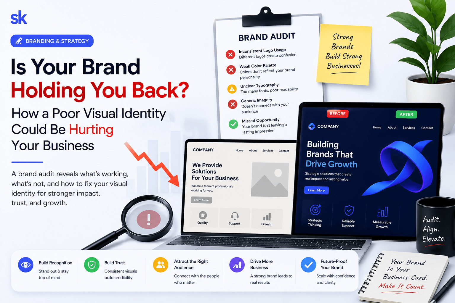
Introduction
Your visual identity is doing sales work even when you are not in the room. Prospects decide whether you look credible in seconds—on your website, proposal PDF, Instagram grid, or Google Business profile.
A brand audit is not about making things “prettier.” It is about finding the visual gaps that create doubt, confusion, or a cheaper perception than your service quality deserves.
Here are seven warning signs and what to do about each one. For identity systems and rollout assets, see our brand design service or contact Shaantik.
1. Your Logo Looks Different Everywhere
If every designer or employee exports a slightly different logo, customers notice inconsistency—even if they cannot explain it.
How to Fix It
- Create one master logo package (SVG, PNG, dark/light versions).
- Document clear space and minimum size rules.
- Remove old logo files from shared drives.
- Update the highest-traffic assets first: website and proposals.
2. Colors Feel Random Instead of Intentional
Too many colors, low-contrast text, or mismatched gradients make the brand look unfinished and harder to read on mobile.
Best Practices
- Limit primary and secondary colors.
- Define accessible contrast for body text.
- Use color for hierarchy, not decoration only.
- Keep social templates inside the same palette.
3. Typography Reduces Trust
Hard-to-read fonts, inconsistent heading sizes, and cramped line spacing make strong offers feel less professional.
How to Fix It
- Choose one heading font and one body font.
- Set mobile type sizes before desktop polish.
- Use consistent H1–H3 hierarchy across pages.
- Avoid decorative fonts for long reading text.
4. Imagery Quality Is Uneven
Stock photos that clash with real team photos, stretched images, or low-resolution icons signal low attention to detail.
Upgrade Plan
- Use a consistent photo style and crop ratio.
- Replace outdated office or product shots.
- Compress images without destroying quality.
- Add alt text that supports SEO and accessibility.
6. Your Website and Sales Materials Feel Like Different Companies
If the website looks premium but proposals look dated, prospects question which version is real.
How to Fix It
- Align templates for proposals, case studies, and decks.
- Reuse the same CTA language and visual system.
- Audit PDF exports on mobile screens.
- Train the team on approved templates only.
7. The Brand Never Evolves
Markets change. Competitors modernize. An untouched identity can make a healthy business look older than it is.
Practical Cadence
- Review brand assets every 12–18 months.
- Refresh photography and UI patterns before a full rebrand.
- Prioritize customer-facing surfaces first.
- Measure whether updates improve inquiry quality.
Conclusion
A brand audit turns vague design opinions into a clear action list. Fix consistency, readability, and proof points first—those changes improve trust quickly.
When your visual identity matches the quality of your delivery, sales conversations start warmer and close faster. Work with Shaantik on graphics and brand design.
Frequently Asked Questions
How often should I run a brand audit?
At least once a year, or before a major website or campaign launch.
Do I need a full rebrand?
Not always. Many businesses only need tighter rules, better typography, and consistent templates.
What should I fix first?
Start with the logo package, website hero, and proposal templates—the assets prospects see most.
Can branding affect conversions?
Yes. Clear, consistent visuals increase trust and make calls-to-action easier to follow.
Related service: Graphics & Brand Design — Shaantik brand and graphic design for logos, brand guidelines, social templates, pitch decks, packaging, and motion creatives that strengthen market positioning.